San Francisco-Shanghai Sister City Branding

San Francisco-Shanghai Sister City Branding
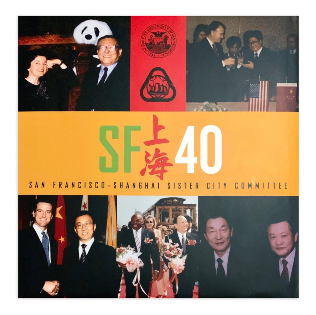
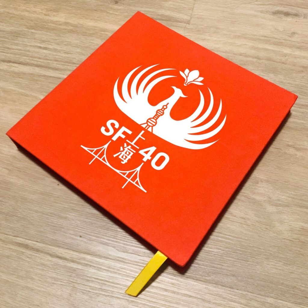
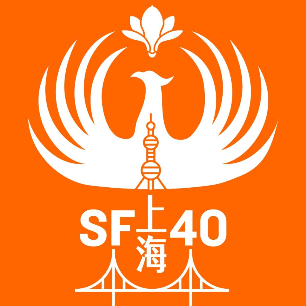
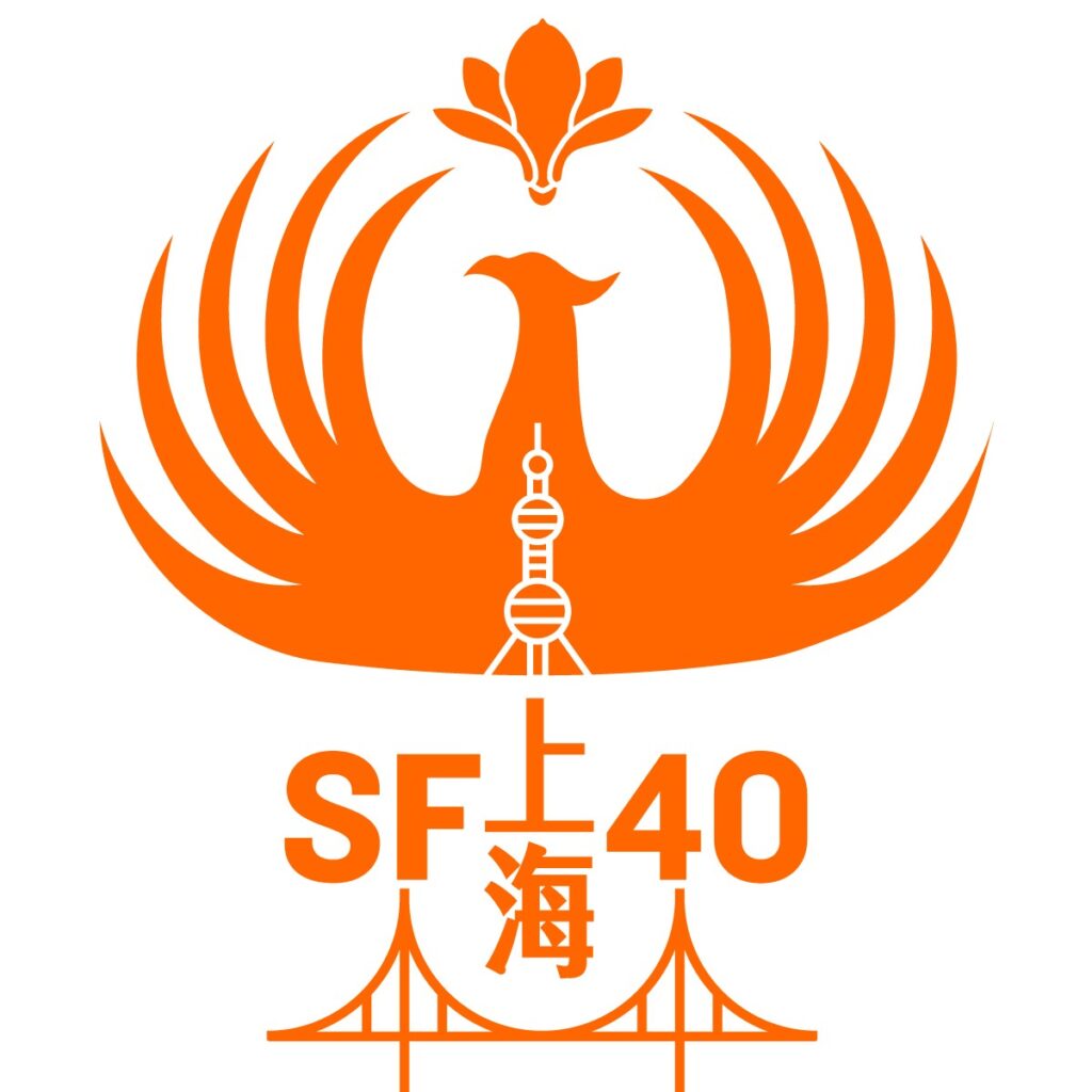
In 2019, I collaborated with James Fang, former chair of the San Francisco-Shanghai Sister Cities Committee, to design the official logo and branding for the 40th Anniversary of the San Francisco and Shanghai Sister City relationship (2020).
James, a Chinese-American deeply connected to both cities, saw the Sister City initiative as a lifelong mission to foster cultural and economic ties between the U.S. and China. He believed my artwork could visually capture the spirit of both cities and symbolize unity, communication, and mutual respect.
Key Design Elements & Inspirations:
40th Anniversary Logo: The Phoenix & Magnolia Flower, inspired by the official symbols of San Francisco and Shanghai.
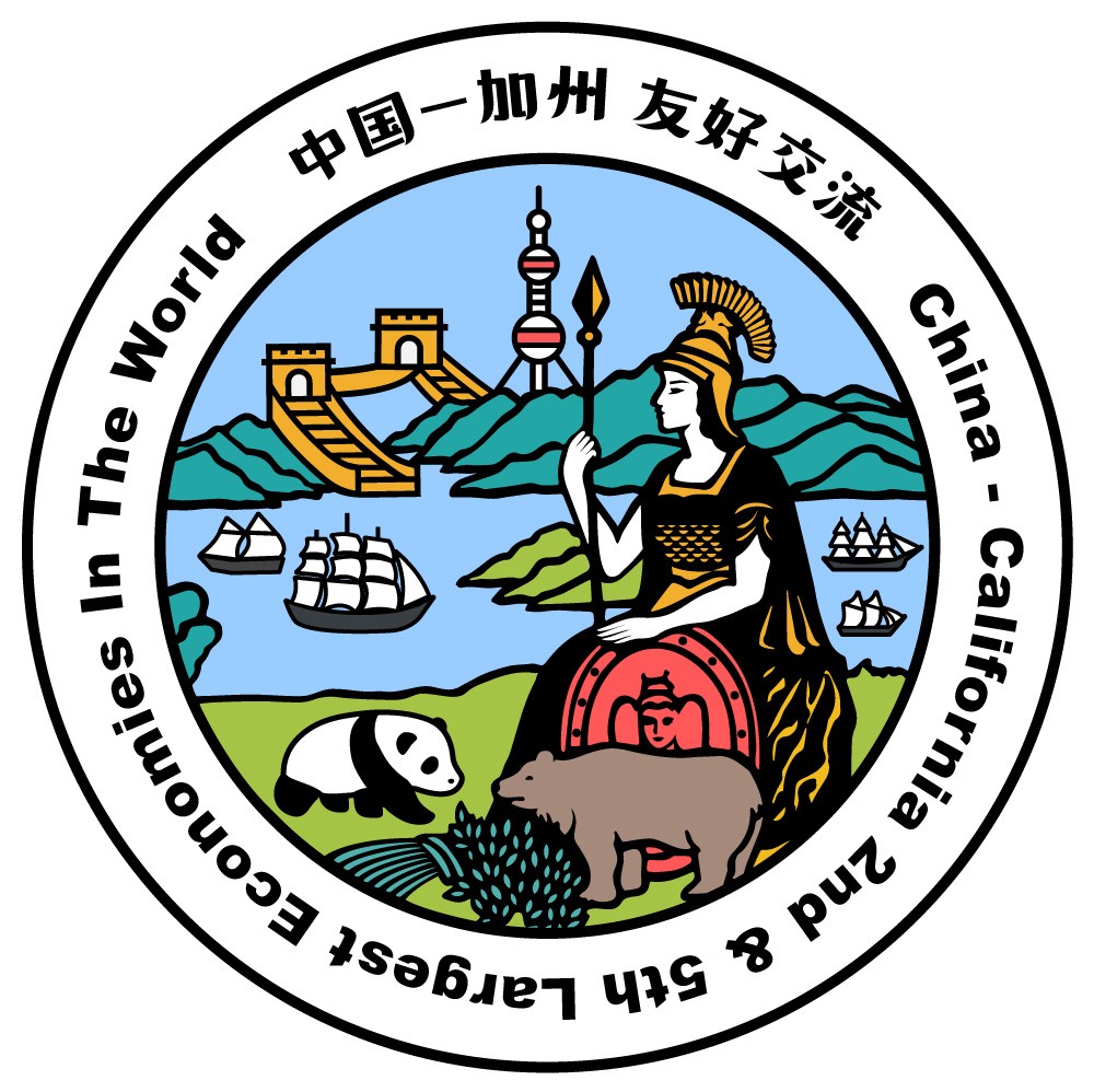
China & California Economic Bond: Referencing the Great Seal of California, recognizing China and California as the world’s 2nd and 5th largest economies.
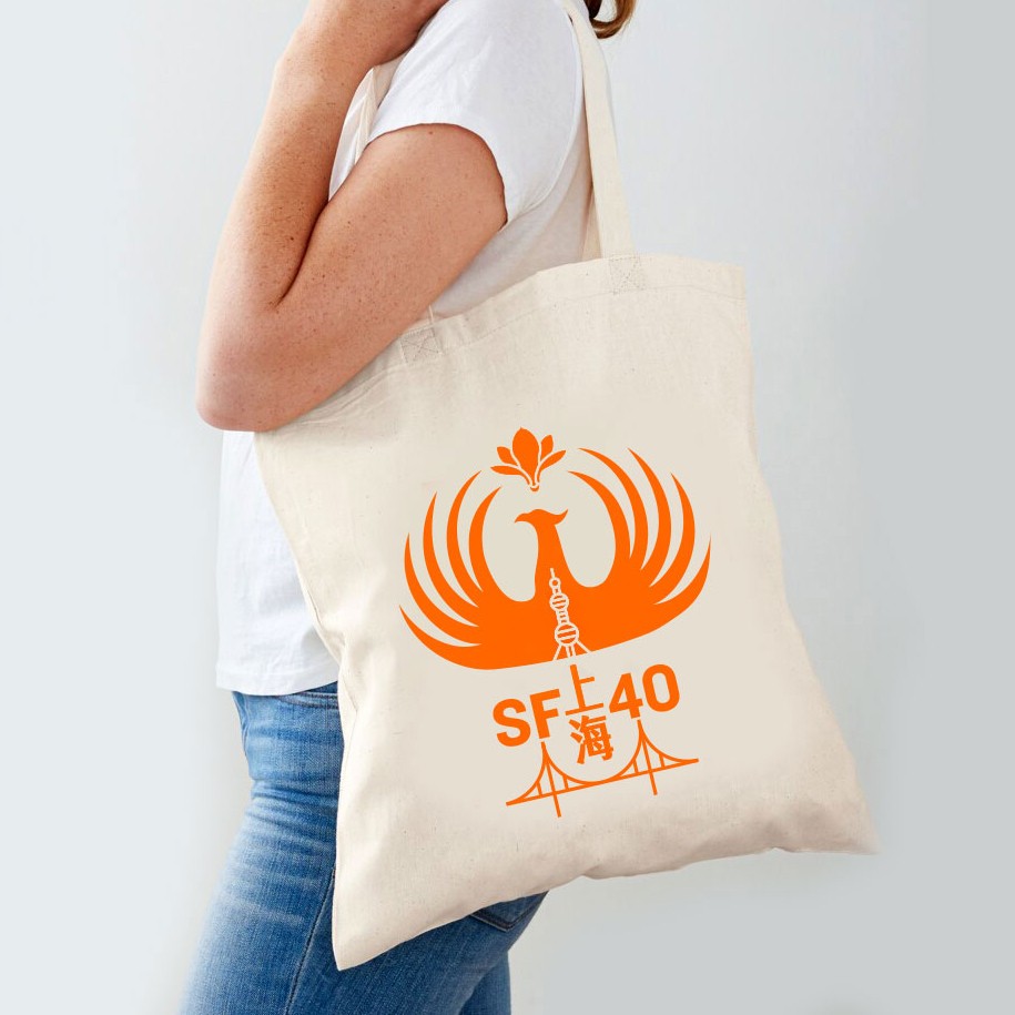
Campaign Applications: The designs were created for use on event materials, including posters, scarves, T-shirts, bags, and printed books—intended to be worn by delegates traveling between California and Shanghai to strengthen economic and cultural exchanges.
This project helped me recognize a deeper mission beyond bridging art and technology—it illuminated my role in bridging cultures between China and the U.S., Asia and the world, the East and the West. Through design and storytelling, I aim to foster understanding, connection, and collaboration on a global scale.