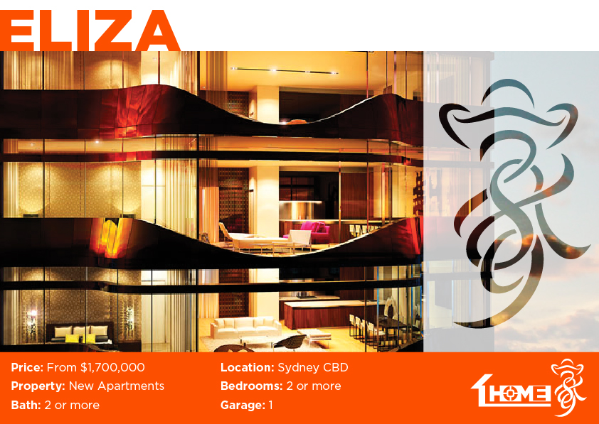
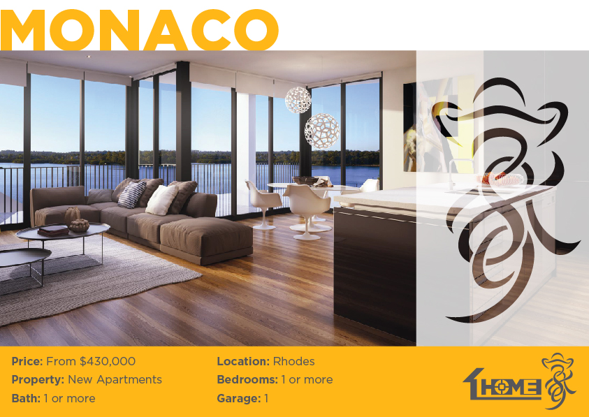
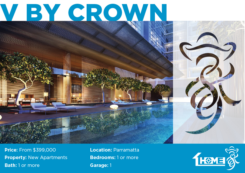
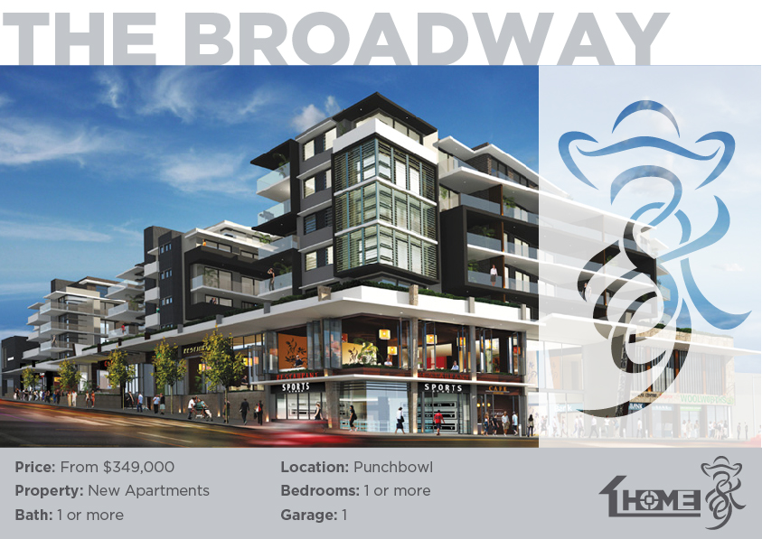
ReBranding: HOME 789
Sydney based Real Estate Agency HOME789’s CEO Australian-Chinese businessman Walton Chu, approached me in 2014 for a company rebrand. He believes that the real estate industry is not about selling a property. Rather, it’s about building the trust and helping clients to attain their dream home and eventually achieve financial freedom; he wanted to have a bilingual branding which translates his philosophy into an icon.
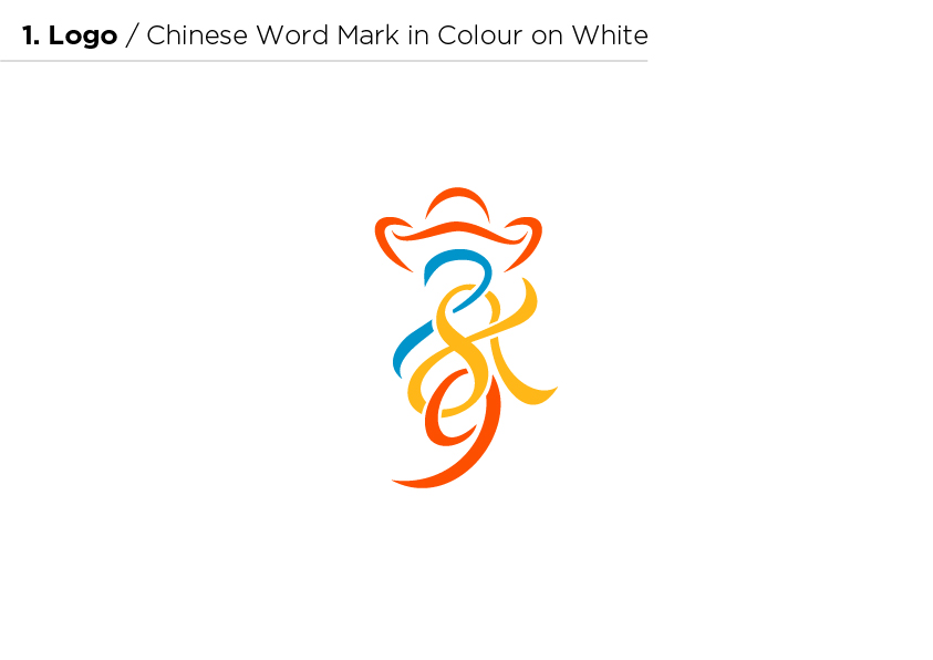
The initial idea for the logo came from Walton’s love for Chinese calligraphy and sketched the original ancient logo word “Home” 家.

7 symbolizes rise or start, which represents the beginning of a new venture and investment. 8 symbolizes growth and development, which represents the building and accumulation of the investment portfolio. 9 symbolizes sustainability, which represents the goal of financial freedom and stability in the long term.
 Overall, 789 represents the key steps to achieve and maintain financial success through a property portfolio and the red color symbolizes luck within the Asian culture. As the business started to prosper and expand overseas, a revitalized logo was required for Asian clients to connect with and easily identify.
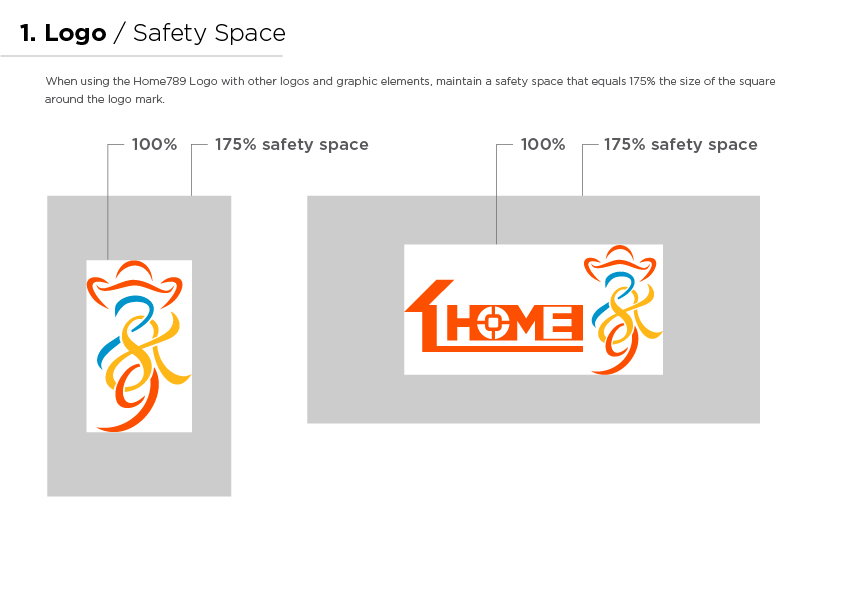
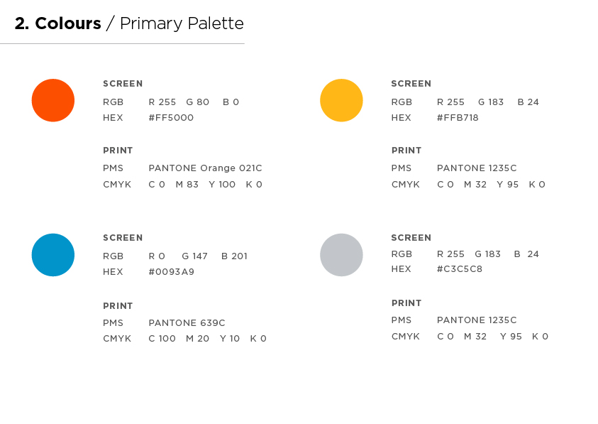
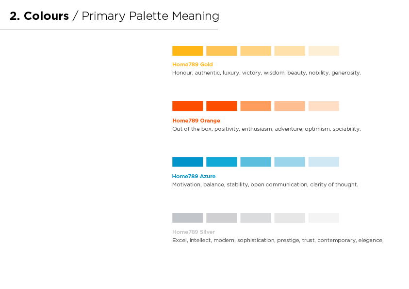
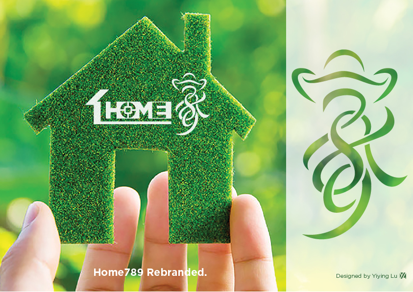
The HOME789 logo is based on the Chinese character 家 meaning “home”. Housed within this “home” are the numbers 7, 8 and 9 interlinked with each other. The logo consists of three primary color variations; orange, gold and blue which when combined gives infinite color combinations, symbolizing live a colorful and vibrant life.
If you look carefully at the top/roof of 家, you will see a Sycee (yuanbao 元宝) ![]() which symbolizes the ancient currency used within China throughout the ancient century, and therefore exudes great fortune and prosperity. With the blessing of the Sycee you will build up the financial portfolio step by step, consequently reaching financial freedom by investing.
which symbolizes the ancient currency used within China throughout the ancient century, and therefore exudes great fortune and prosperity. With the blessing of the Sycee you will build up the financial portfolio step by step, consequently reaching financial freedom by investing.
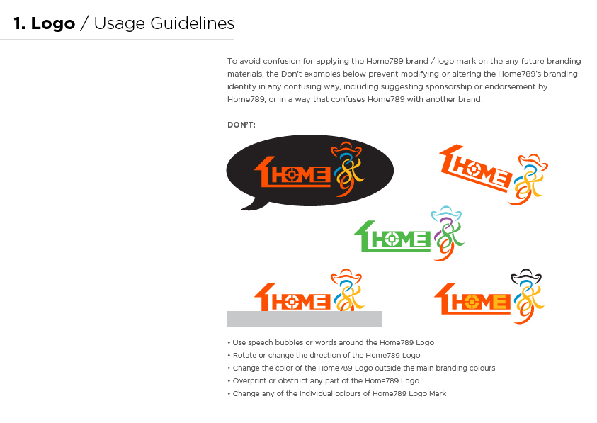
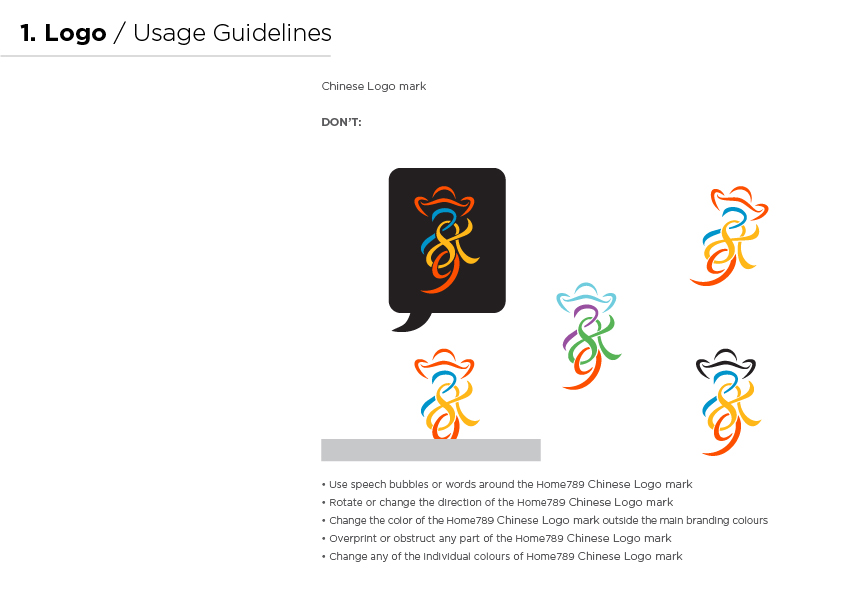
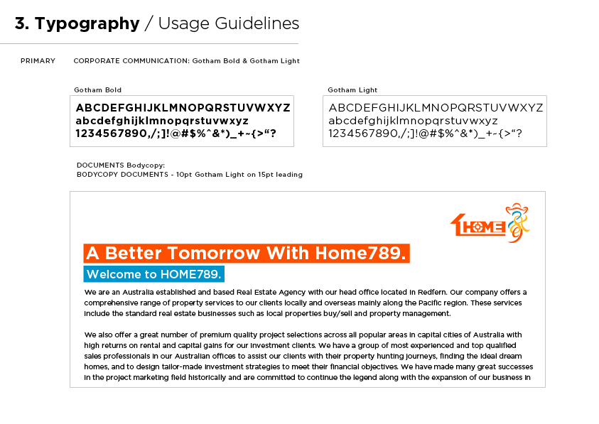
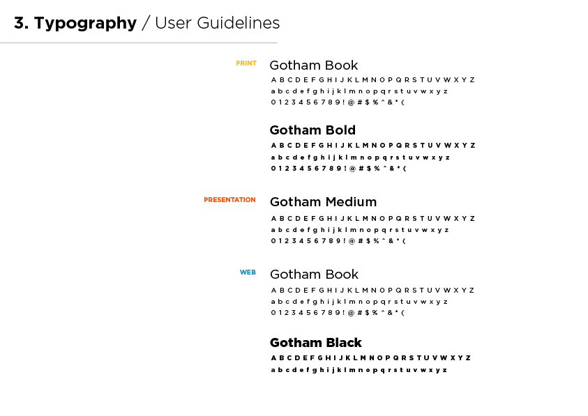
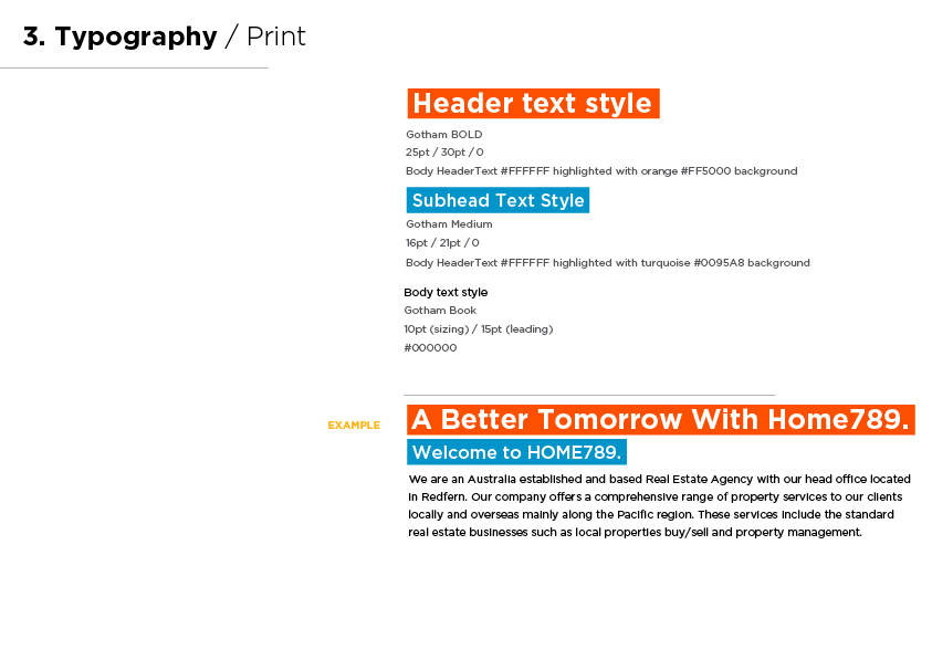
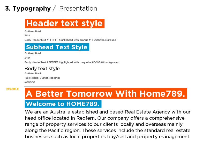
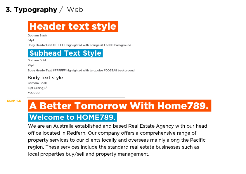
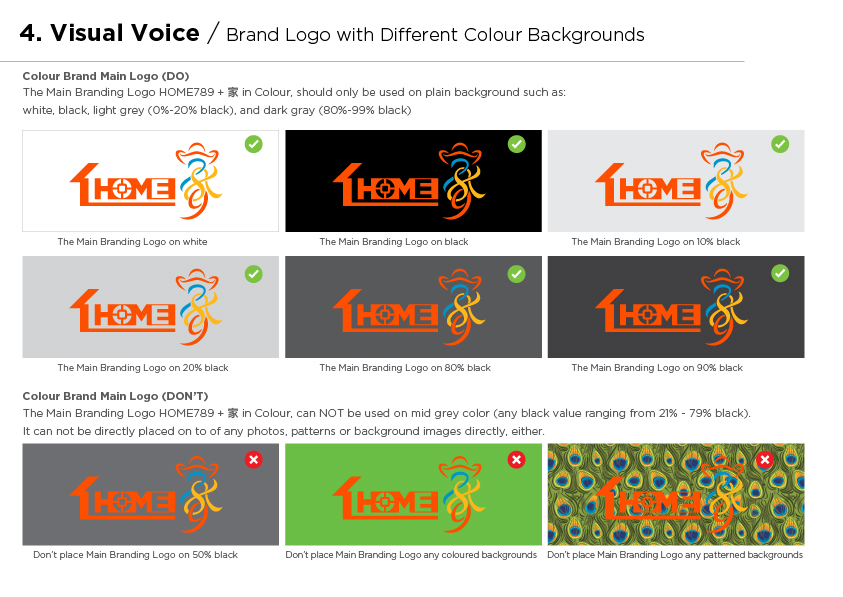
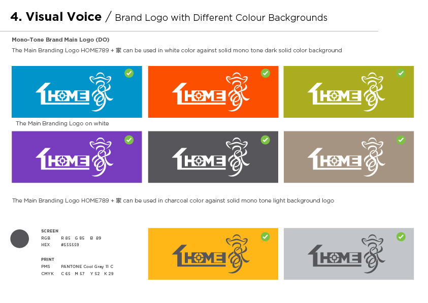
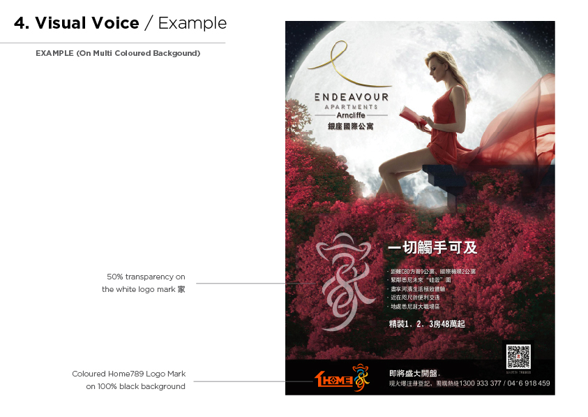
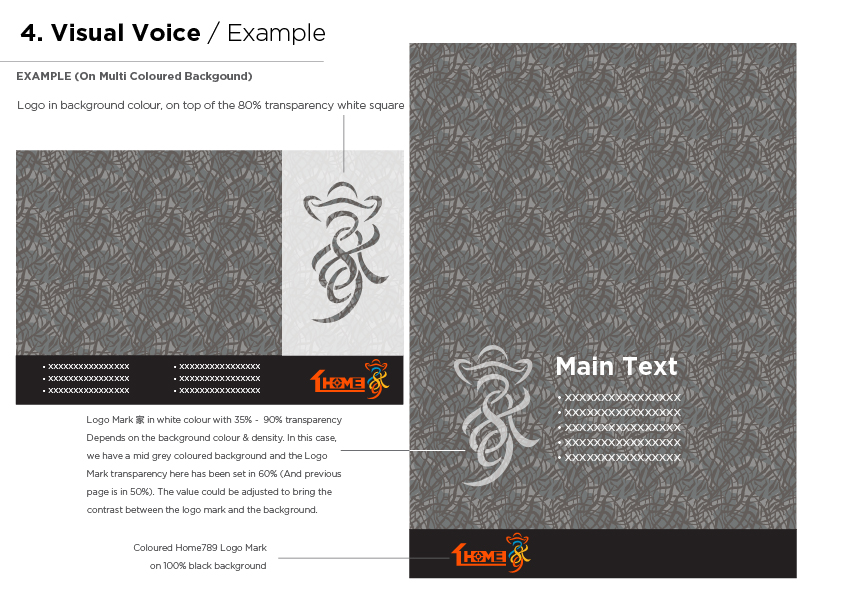
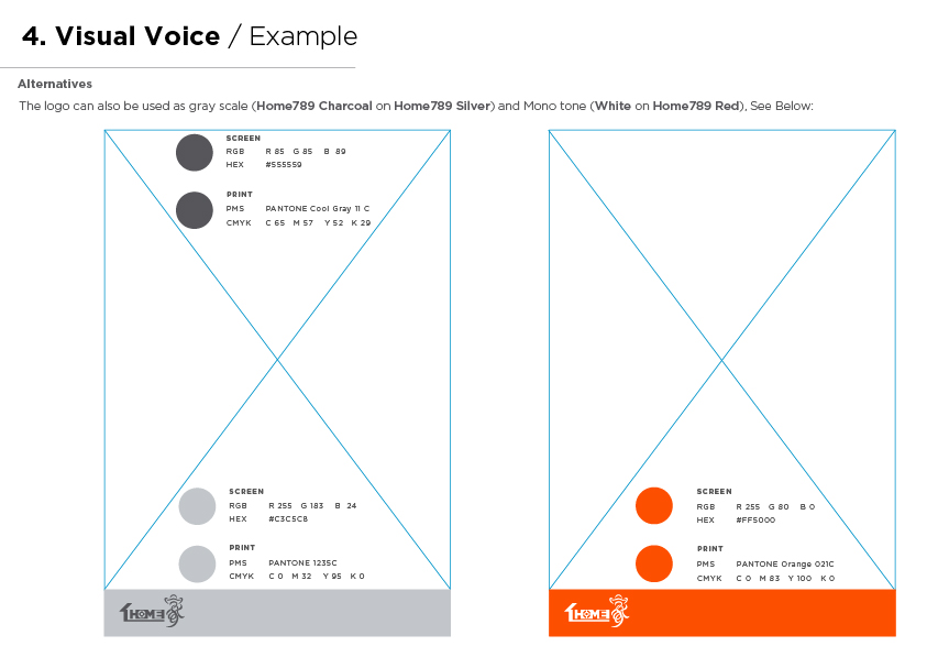
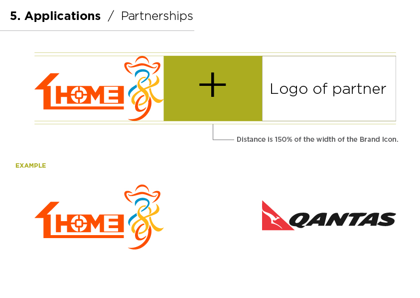
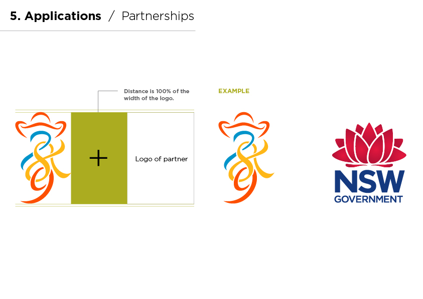
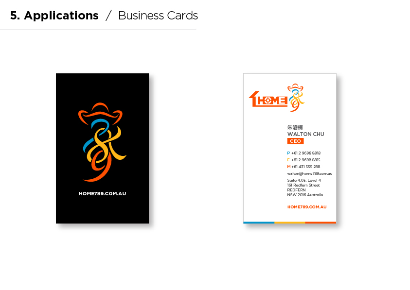
Below is its branding style guide.


